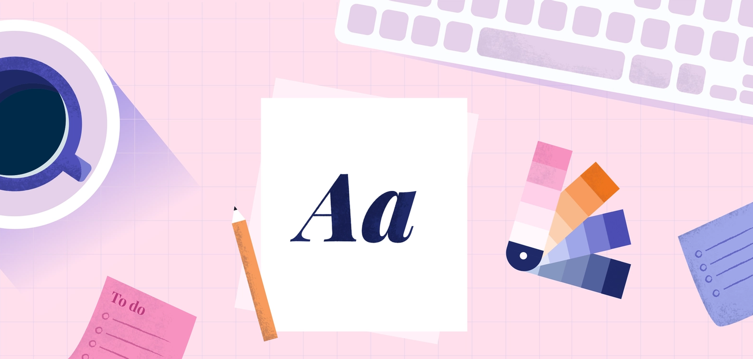
Design spotlight: 6 practical tips to designing content with greater impact.
A friend of mine recently took me to the Barbican in London to see Lee Krasner’s new exhibition, Living Colour. Each room began with an inspiring quote from the artist herself, one of which really stood out for me:
‘You can have giant physical size with no statement on it… And vice versa, you can have a tiny painting which is monumental in scale.’
While Lee Krasner is talking specifically about paint on canvas, this insightful statement is crucial for any great design. Design can only be successful when it effectively communicates with its audience. Whether this communication takes place through a powerful image on social media or a friendly typeface reflective of your organisation’s identity, great design, no matter its size can be monumental in scale.
1. Start with a purpose
Creating content for a daily Facebook post or for an upcoming blog article? Either way, it’s important to take time to define your project goals before you begin designing your content. A great starting point is to think about the kind of message you want to relay to your audience. Do you want your content to:
- Empower and motivate?
- Educate and give insights?
- Delight and inspire?
- Solve a problem?
- Promote a product, service, workshop or event?
2. Choose your weapon
The right kind of design for your content can make a big difference in the way you share an idea with your audience.
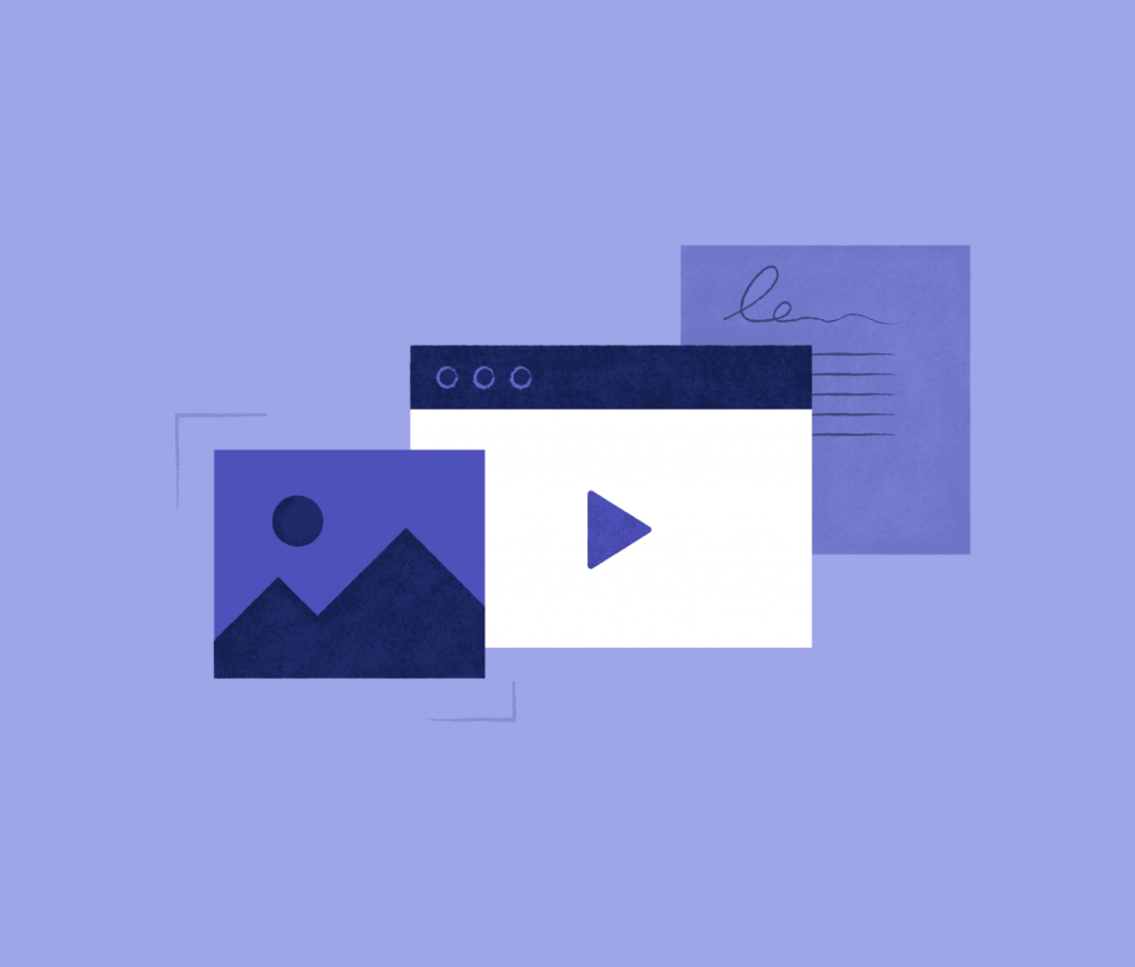
Graphics and photos
Visuals are consumed more easily than text, that’s why communicating an idea through a visual (whether it be through a banner, photo, or poster) can be much more effective than just using words.
Videos and animations
With videos, you can bring any concept to life. Not only are they a great way to engage your audience, but they provide a wider range for story-telling than a static graphic.
Data visualisations and infographics
Need to share your latest research? Charts, diagrams, maps, and graphs are great for quickly digesting and understanding complex data.
3. Define your hierarchy
Visual hierarchy is one of the most powerful and fundamental principles of design. This is when extra visual weight is given to the most important element of your design so that your audience is drawn to a focal point. The key to defining your content’s hierarchy is to first identify what information is most important to your audience. If you’re designing an e-invite for an upcoming event, you might put location, time and date at the top of the message. Here are a few ways to create effective visual hierarchy in your content.
Size: Use larger or bolder fonts weights to highlight key information
Order: Place key messaging higher on the page than the other design elements
Colour: Use colour to attract attention to an element in the page
Proximity: Elements sitting close to each other give the impression that they are related
Whitespace: Don’t be afraid to give a little breathing space to a part of your design to draw attention to it.
4. Be kind to typography
Typography should complement your purpose. Not only does it communicate your core message, but it also says a lot about your identity. A more whimsical font isn’t going to be appropriate if you’re telling your audience about something serious. While selecting fonts can be time-consuming and can be quite expensive, there are many affordable options and resources available:
Google offers more than 900 free commercial use fonts as well as recommended font pairings.
Looking for something a bit more playful? Creative Market sells many affordable decorative options.
Typewolf can help recommend the perfect font combination for your next design project.
I have been using Typewolf for years as inspiration for my own projects.
Shout out to Lightful’s platform team lead, Joseph Race for introducing me to this font manager, you can try and install fonts all from the cloud!
5. Design for everyone
Creating content that is accessible doesn’t need to be complicated or expensive. Here are a few simple tips I like to keep in mind.
Always provide sufficient contrast between foreground and background
Tools such as WebAIM and Colour Safe are fantastic resources to ensure your design always has sufficient contrast between foreground and background for typography and colour.
Don’t use colour alone to make important information understandable
When you’re communicating something pertinent, showing an action, or prompting a response, don’t use colour as the only visual cue. People with low visual acuity or colour blindness will have a hard time understanding your content. Instead, try using colour to highlight or complement what is already visible.
Be mindful when designing copy
Light font weights and small text sizes can be quite challenging to read for those who are visually impaired, especially on small screen sizes and older monitors. A good rule of thumb is always to keep your font sizes above 16px and stick with font weights above 400 (normal).
6. Above all else, keep it simple.
Believe it or not, this is one of the hardest things to master as a designer. Fewer distractions in your design can offer more room for your idea to shine through.

Start with the basics
My dad once said to me “You need to first understand the basics before adventuring into something new”. This is something I have carried with me since the beginning of my career. Tools such as Coolors are great resources to inspire, learn, and experiment.
Less is more
When selecting typography a general rule of thumb is to not use more than three fonts. The fonts you select should create harmony, not conflict with each other. Try pairing a serif font such as Playfair Display with a sans serif font such as Source Sans Pro to achieve greater contrast and a personal touch.
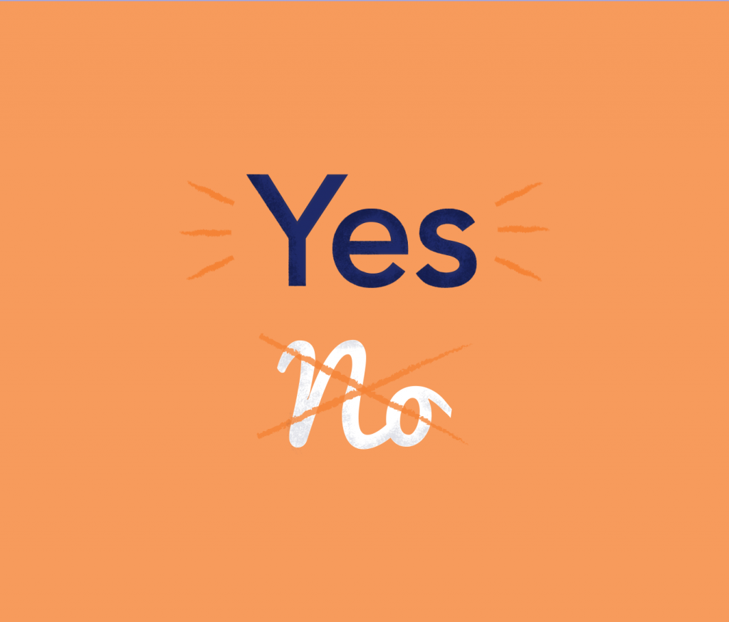
Moderate call to action use
Remembering Krasner’s advice, practice restraint when it comes to effectively communicating with your audience. Using multiple call-to-actions in design can not only overwhelm users but also dilute your message. Try using a single call to action that packs a punch. I like to write call-to-actions that are not only instructional but also delightful.
Design spotlight
Join the Lightful design team over the next coming months to learn best practice tips and tricks to amplify your organisation’s impact!
Latest articles

In a world of growing uncertainty, small and local non-profit organisations often find themselves with competing priorities and struggle to plan how to allocate their available resources. Despite the increasing demand for their vital work, they are not always able to allocate the funds they receive to strategic planning and future growth.

As the world becomes more digitally-focused, it’s essential for nonprofits to have a digital presence. With more and more options for online engagement, we know that this can be challenging for nonprofits to tackle. But, we also know that it is a huge opportunity to increase audience engagement, awareness and fundraising. To help nonprofits navigate this, we’re going to explore the “whys” and “hows” of creating a nonprofit digital strategy. We’re even providing a free digital strategy canvas to help nonprofits improve their online presence in just a few steps.
Related posts

How familiar are you with sustainable web design? Here are Lightful, we are currently working on a redesign of our website so we wanted to find out more about sustainable design and what this means for us.

Guest post by Felicity Hamilton – Junior Designer at Social Misfits Media
See who we help


Contact us
Want to learn more?
Email Jonathan and start a conversation